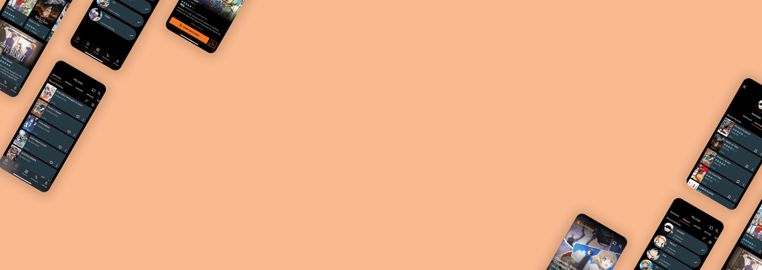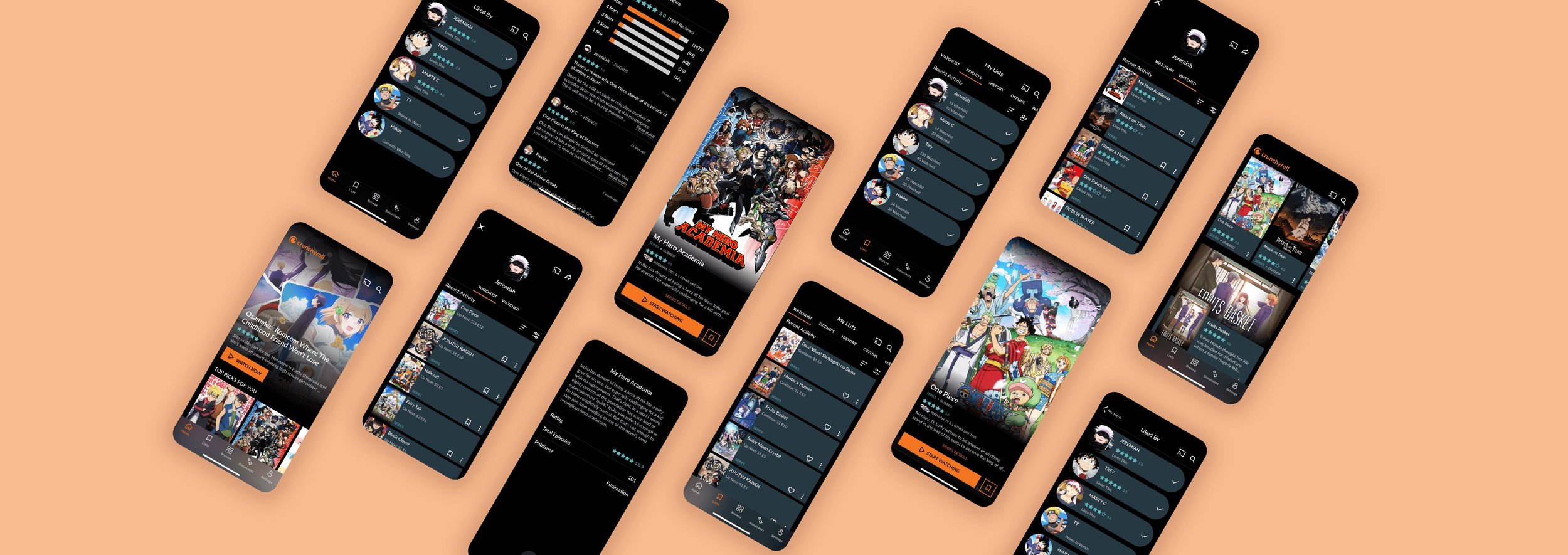
The ultimate anime streaming experience.
Overview
Crunchyroll is one of the first streaming services of its kind and continues to be one of the biggest anime platforms - so I wanted to see if I could add something valuable to the app. Through research I found that users were looking for better ways to discover new animes & that the process itself had a few gaps that could be filled.
Solution
I found that there was a gap going between anime to anime as users needed to do their own research to find what they wanted to watch next. I used my research insights to integrate community and ratings within the app to increase discoverability and engagement.
Responsibilities:
UX Research, Wireframing, Prototyping
The Team:
Me - Solo Project
Tools:
Figma, Zoom, Airtable, Miro, Maze
Duration:
4 weeks
CONTEXT
In recent years, especially with the pandemic, anime has been gaining a lot of traction.
Netflix, who even produces their own anime now, reported that in the first nine months 2020, over 100 million households watched at least one anime title (That’s 50% more than in 2019).
With an increase in veiwers streaming services like Netflix & Hulu are starting to provide viewers with big name animes, making them a huge competition for the anime only service, Crunchyroll. Another anime powerhouse, Funimation, recently launched their own service. Although Crunchyroll has seen a boost in suscribers, to keep up they have to ensure their fans are getting what they need.
& that’s exactly what I wanted to find out.
OUTCOME
Integrating community within the anime streaming experience.
1. Adding Ratings & Reviews
With so much content and so many animes to choose from, ratings were proven to be crucial to the discovery & validation process. Crunchyroll users heavily rely on the ratings of an anime to decide whether or not to watch any particular anime.
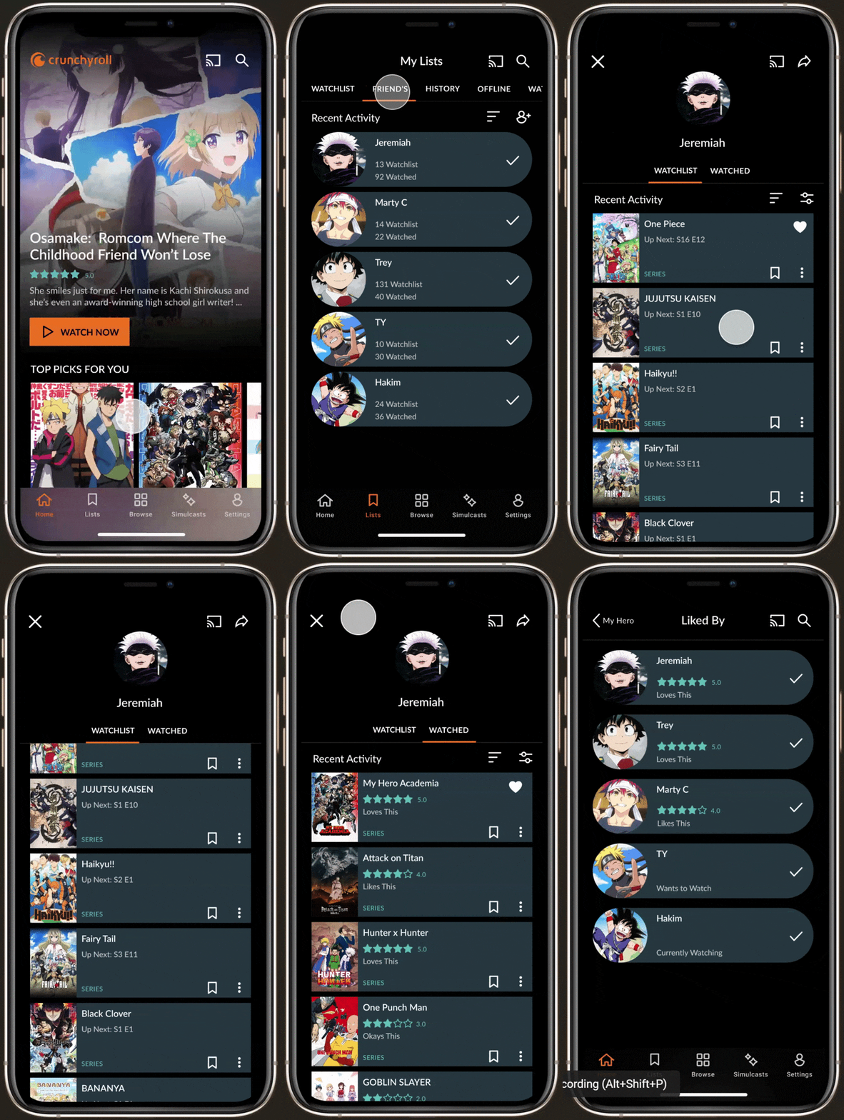
Throughout the app, anime cards have ratings displayed to give the user an idea of what people think before even clicking on it. This way, even as they scroll through collections, they have a general idea of what people think. They can also access full user reviews pulled from Crunchyroll’s website, within the anime’s page.
2. Seeing who likes this anime
Research shows that so many Crunchyroll viewers go to their friends for the next recommendation, but this process requires exiting the app and waiting an extended period of time for a response.
Now when he is looking into a show, he can see what his friends think, right then & there. The “Liked By” feature shows which of his friends have watched an anime, what they think, and who is currently watching. Inspired by Instagram’s liked feature, the avatars give him an idea of who has engaged with this anime, and overall feels familiar.
3. Going straight to their watchlist
My surveys and interviews made it extremely apparent that not only did users trust their friends the most when it came to recommendations, but they were also curious as to what they watch. Using this, I decided to implement a feature that allowed users to see each others watch history & watchlist.
Users can now add their friends and access their watchlists too. Now, when they go to their watchlist, they have quick access to friends. They can see what friends already watched plus their ratings, and what they are interested in watching at the moment.

How might we make discovering animes easier within the app?
RESEARCH
Checking out the competition.
Before moving forward with any design decisions, I needed to take a look at what their competitors were doing and what the active Crunchyroll community was saying.
An extensive study on our competitors and a SWOT analysis showed me that Crunchyroll could use a few upgrades. Besides some quick fixes with “Skip Intro” & Autoplay, fans were looking for better ways to discover new animes.
This is where I was really inspired by Spotify - they make discoverability to much fun with all of the social features they have integrated within the app.
How are anime fans finding new shows?
I understood that discoverability could be improved, but how exactly? To find out I conducted surveys & face-to-face interviews with 7 participants - I wanted to know how fans picked a new anime to watch & what their motivations were. It was here that I was really able to pull some insights on their decision making.

“I trust my friend’s reviews the most for new animes, so I would love to see what they think”
— Participant 5
DEFINE
Finding new shows isn’t the smoothest experience.
After speaking with users about their discovery process, I had to defining the ideal user for Crunchyroll as it was crucial to understanding the pain points they are dealing with. Most anime fans have habits unique to this subculture of streaming. I needed to define a key user to better understand their motivations & frame the rest of my design based on that. For this, I created a persona - Brian - he became the reference for the rest of my design decisions moving forward in the ideation phase.
Through extensive journey mapping of Brian’s discovery experience, it became clear that going from one anime to another wasn’t the smoothest process.
Many users find themselves not wanting to commit to an anime they might not like, and in turn often leave the app to browse forums and read reviews. For those who go to friends for their opinions, that meant leaving the app and waiting an extended period of time for a response.
IDEATE
How do we combine the two?
As I mentioned before, reviews matter & friend’s matter more. Thus began the brainstorming process. The major challenge here was identifying possible solutions that would be able to integrate within the current app seamlessly. The current app has its own design system that I had to work within while touching on user pain points.
I started by taking my insights and crafting How Might We Statements to better understand how I could address each pain point.
Through these sessions & crafting different flows, I played around with a few possible additions to the current app and narrowed them down to 3 key features:
INFORMATION ARCHITECTURE
Ensuring the new features would fit seamlessly.
The solutions were only part of the challenge, to ensure that the feature would truly integrate seamlessly into the app, I needed to look at their current sitemap & make adjustments where needed.
On the frontend, the Friends List feature was simple enough, but it came with the added concept of user profiles. This meant being able to adjust your own list & privacy settings, as well as seeing what your lists would look like to others.
EXPLORATION & ITERATION & TEST
Testing where the features go
1. Adding Reviews & Ratings
While pulling reviews was simple enough - straight from their website - a huge consideration was where exactly to put them. Anime headers had to fit a few key things: The title, media type, description, & a Series Details label that signified to users to keep scrolling for more. Adding the star ratings would push the label behind the Start Watching button. To mitigate this & stay within the original design system, I opted to decrease the description length.
Another consideration for reviews, was placing them into the various card designs in the app. The only huge concern I had here was the possibility of each card feeling too cluttered. To keep from the info in each card from seeming endless, I opted to make the star ratings in the Crunchyroll teal, adding contrast and making it scannable.
2. Seeing who likes this anime
Through my research I found that most anime fans tend to keep track of animes they are watching & have already watched. Implementing this within the app would mitigate having to leave & keep track of this information.
The “Liked By” feature would show more than just which friends have finished this anime, but also those who is currently watching or have them on their watch lists. Animes can be long, so most users wouldn’t be able to rate until they finish - showing users who are currently watching allows community to see what is going on. Even if an anime isn’t rated, users can see the whole picture & make decisions from there.
To implement this feature visually - I opted for a label that felt similar to Instagram, making it easy to recognize. The friend avatars would immediately make it apparent that there are other users interested in this anime.
3. Going straight to their watchlist
Like I said before, anime fans regularly keep track of shows they have watched, want to watch, & have watched - site likes MyAnimeList. Not only do they keep track of them but they share them with friends for recommendations.
To implement this within the app I played with a few options. Through usability testing I was able to narrow them down to accessing Friends through the My Lists tab. Testing also showed that I had the same problem with this flow as I did with the Liked by - going from this list to a profile to another list becomes endless. To mitigate this, friend profiles were redesigned as a top sheet with their avatar to differentiate this page from the rest of the flow.
Similarly friend cards were redesigned with rounded corners to visually differentiate friend cards from other pages.

OUTCOME
Final Thoughts
I found this project really challenging but really fun as well. As an anime fan, it was enjoyable seeing how excited user’s were getting talking about their experiences and during the interviews & usability tests. That being said, adding friends would be a huge aspect of the app & since it isn’t already in the current app there would be a lot of technical considerations. The MVP of this design would simply be incorporating the reviews pulled straight from the Crunchyroll website.
Research was crucial for this project, as to add a new element to the existing app, I needed to find out where user’s paint points really lied. As a result, I dedicated a majority of my time to look through reviews and forums to get a better idea of what Crunchyroll users have really been asking for. I also looked to methods like journey & empathy mapping to validate these assumptions and solutions.
This project really forced me to challenge my creativity to come up with a solution that tackles both discoverability and social elements while adhering to Crunchyrolls UI and business goals. It helped me practice implementing new designs that had to fit within an already established design system and ensure consistency throughout the app. This was also particularly difficult as I had to make sure that the new features would not only work well, but leave the rest of the app functionalities undisturbed.
What I learned:
How to work with and adhere to the current branding and UI constraints when designing
How to work with an established design system & information architecture and seamlessly implement a feature within that
Next Steps:
Clean up files and prepare them for handoff
Develop and create designs for how user’s would actually add their friends
Create designs for user privacy preferences within the settings


