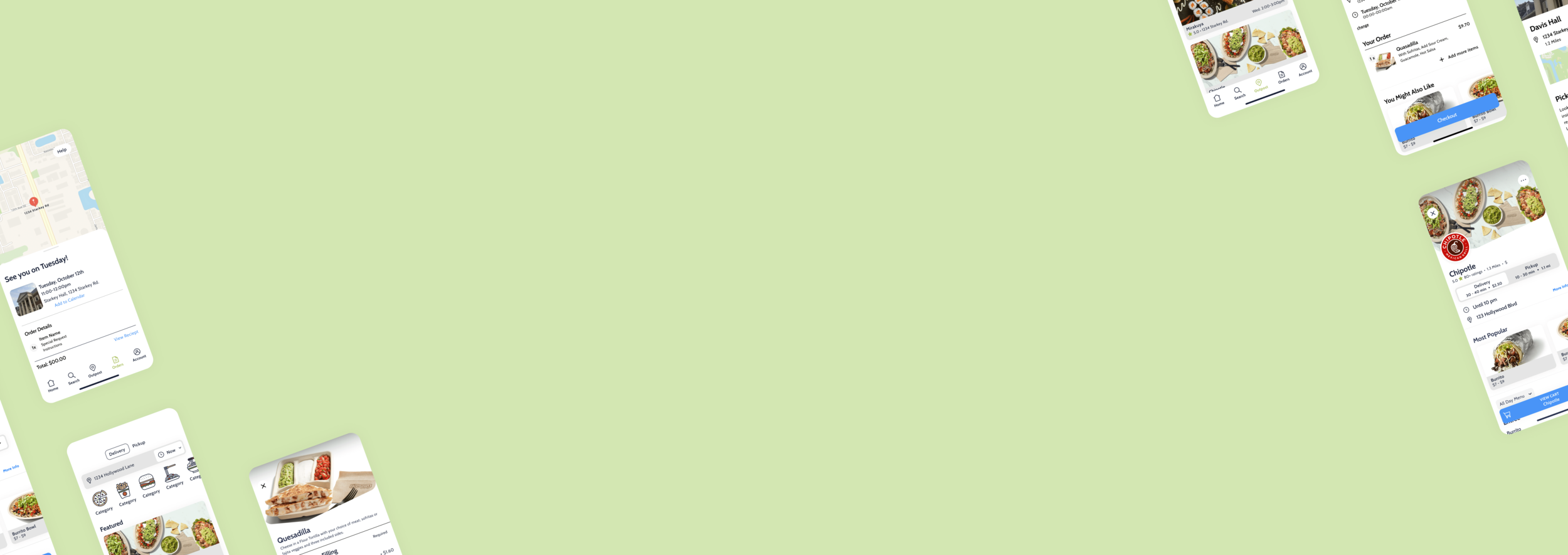
For the students, by the students.
Overview
Easy Eats strives to make food delivery as easy and efficient for students as possible by allowing dorm students to get their food delivered right to their dorm doors, by other students. For the new school year, they were looking to relaunch their app with a new Outpost feature.
Solution
Myself and the ever so talented -Reese Rose- were able to give their app a complete face lift with a redesign. We were also able to conduct research and ideate to design and prototype their new Outpost feature, allowing students to order ahead to Outpost locations all over campus.
My Responsibilities:
UX Research, UX Design, Prototyping
The Team:
Christian Khrog (CEO),
Reese Rose (UX Designer)
Tools:
Figma, Zoom, Typeform, Miro, Maze, FigJam
Duration:
8 weeks
CONTEXT
For many students living in college dorms, food delivery through apps like UberEats & Doordash comes with one huge limitation, they can’t get it to their door.
Most dorms restrict access to the buildings to students only, so students have to go outside and meet their drive to pick up their food. Easy Eats combats this by allowing students to be the drivers, making delivery a seamless process.
To take this experience to another level, they wanted to implement a new Outpost feature. This would allow students to order meals ahead by days up to a full week that would be delivered to a campus outpost - for free. They could plan meals to fit within their class schedules or order a day ahead just for that free delivery.
Outposts optimize deliveries for both students & drivers
The goal of the Outpost is to allow students to plan ahead if they need to or just get free delivery sent to convenient locations on campus. For the business, this meant more meals could be delivered to multiple students at one time to specific locations instead of staggered one meal deliveries throughout the day.
The Outpost looked to optimize delivery slots to fit seamlessly into the schedule of busy students while simultaneously optimizing deliveries for the business as well.
Business Goals
ESTABLISH BRAND
INCREASE ENGAGEMENT
INCREASE GROWTH
INCREASE AWARENESS
FINAL DESIGN
An all encompassing food delivery app for busy students
A complete facelift
A key aspect to the redesign for the new launch was giving the existing app a facelift. The redesign incorporates the Easy Eats brand and mood while improving usability with a few key changes.
The new design also incorporates an in app rating system & updated onboarding. The onboarding process was limited to just name & email - but that wasn’t enough. The new process allows for students to not only choose their school, but request new schools and locations as well.
Options within the Outpost itself
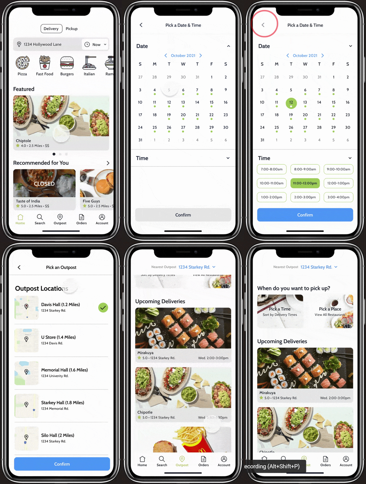
To give users the most options within the Outpost feature, we designed a starting homepage that allows for 3 separate flows.
The top section allows users to pick whether they want to order by delivery time, or restaurant, while the section below it highlighted the upcoming deliveries- for students who wanted to eat ASAP.

How do we ensure students are given the option for both Outpost & Deliveries in a way that makes sense to them?
RESEARCH
Students need convenience & efficiency.
The Easy Eats team had already done some testing with the Outpost feature idea using their current app. With this, they saw an 30% increase in orders - students were definitely interested. There was a huge problem though, since the current app doesn’t allow for a separate Outpost feature, they were left confused about the whole process.
To get a better understanding of what was really going on, we conducted some surveys to get feedback from existing customers. While we waited to gather information from current users - we opted to get feedback from the Easy Eats team as they are all current students as well. We needed to know what they needed in terms of scheduling and what was could be improved in the current app as well.
Key Insights

“I need something that is flexible with my class schedule. Oh and in app customer service would be great.”
-Participant 3
BRAND IDENTITY
Establishing a brand students identify with.
Since the existing app was white labeled, the Easy Eats brand was essentially, non-existent. After discussing with the Easy Eats team and stakeholders, we decided that the Easy Eats brand needed to focus on a few things:
inviting & approachable
modern & fun
dedicated to students
This needed to be established not only within the app, but throughout all Easy Eats materials.
VERSION 1
FINAL DESIGN
DEFINE
Creating the easiest experience for busy students.
When ideating on how the new Outpost feature would work and what it would look like, we had to keep a few different constraints in mind.
How would students order for specific time slots that work within their schedule?
What about for students who want to eat as soon as possible?
Or those who don’t care about the time, they just want their favorite meal without paying delivery fees?
EXPLORATION & ITERATION
Understanding the Outpost flow.
After talking to the stakeholders about what they wanted to see in the Outpost & some of the technical constraints we needed to consider, we started by playing with 3 different possible flows. Each one starts with a different screen that takes the user through a different process:
PICK YOUR RESTAURANT, THEN THE OUTPOST LOCATION & LASTLY THE PICKUP DATE & TIME
FLOW 1
The restaurant may not deliver on certain dates & time slots
Users have to go through the whole flow to find out the date/time doesn’t work
PICK YOUR OUTPOST LOCATION, THEN THE RESTAURANT & LASTLY THE PICKUP DATE & TIME
FLOW 2
This doesn’t allow for easy access to immediate deliveries
Users have to go through the whole flow to find out the date/time doesn’t work
PICK YOUR OUTPOST LOCATION, THEN PICKUP DATE & TIME, AND LASTLY THE RESTAURANT
FLOW 3
This flow limits what restaurants the user can choose from
Doesn’t allow for students to order from a specific place regardless of the time & place
As we tried to understand the logistics of the feature itself, more and more possibilities started to emerge, and narrowed it down to the original three. We wireframed every screen for each flow to give the rest of the team a better idea of where limitations fall for each flow, and what actually works quite well.
With feedback from the stakeholders and usability test participants, we decided the 3 flows were not comprehensive enough. If the feature only allowed for 1 flow, user’s would be limited to ordering now or later, not necessarily both.
To condense the process, we created an initial home page that would allow for different flows. This new flow allows users to pick between ordering by Time or Place to send them off to the respective flows. This allowed for the most flexibility for students as well as the Easy Eats drivers.

OUTCOME
Final Thoughts.
As we were ironing out the Outpost flow, we thought of so many flows, and we designed all of them. Even though they got scrapped, each iteration taught us so much about the next.
This project was so exciting to take on. As a recent graduate I definitely understood the struggle of these students who just wanted some food right to their door during finals. I was also able to communicate directly with stakeholders and get their feedback throughout the process, and learned how to work with actual technical & budget constraints.
This opportunity also allowed me to work on a team, with another oh so talented designer, Reese Rose. We were able to bounce ideas off of each other and communicate what we felt worked and didn’t work throughout the process. This gave me the chance to not only give feedback but gain feedback on my own ideas & designs- as well as explain my decisions & thought process


